Landing Page Design
Verisk ClaimSearch
Project Overview
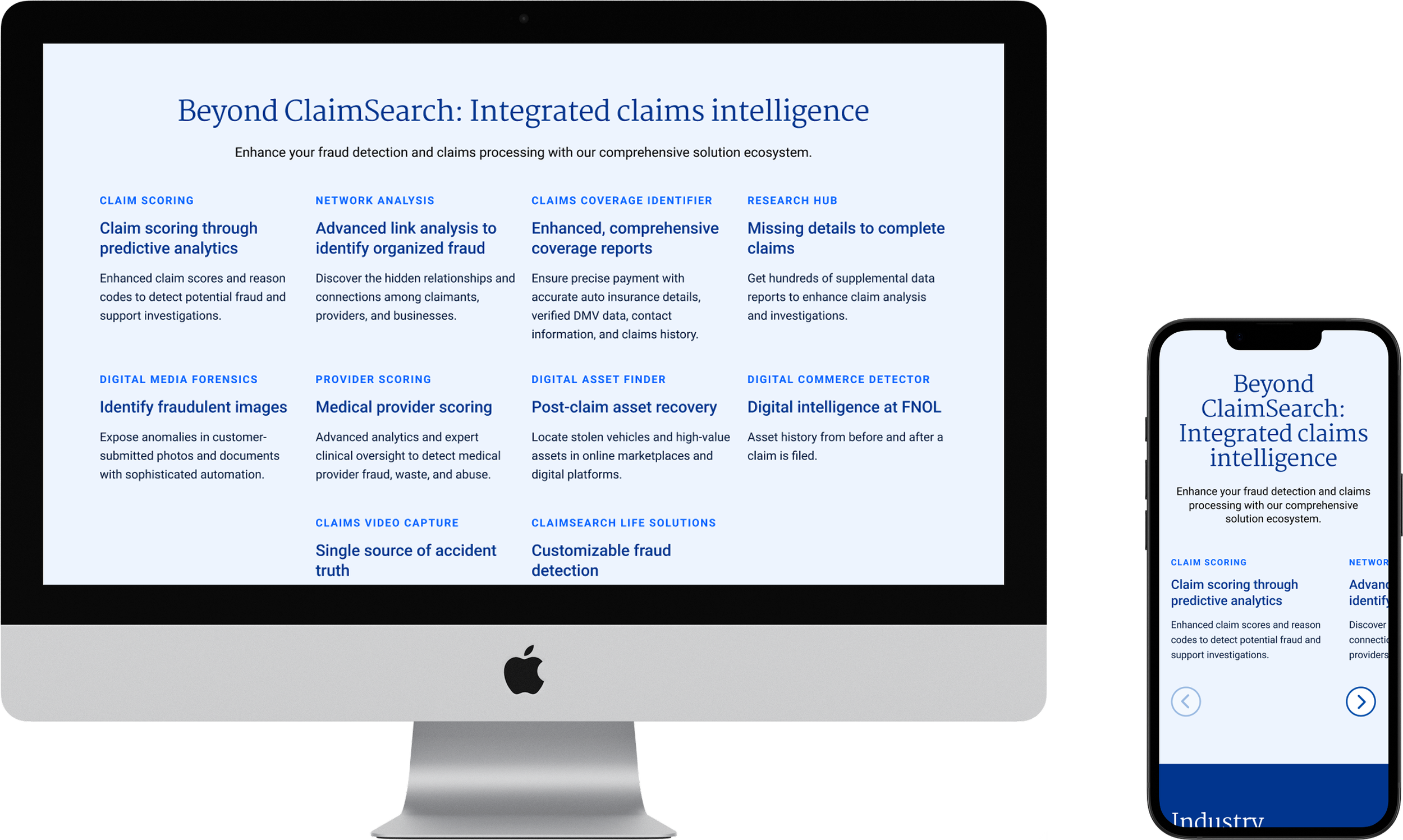
As regulatory pressure, fraud sophistication, and customer expectations continue to rise, Verisk is reaffirming the central role of ClaimSearch as the insurance industry's most trusted contributory claims database. With over 1.8 billion verified P&C claims and contributions from more than 1,850organizations, ClaimSearch is the foundational platform powering smarter, faster, and more secure claims decisions.
To ensure this story is told with clarity and impact, Verisk engaged Ammunition to design and develop a dedicated landing page that brings the platform’s scale and strategic importance to life.
-
Verisk
-
2 weeks
-
Product Designer
-
Wire Framing
Prototyping
Visual Design
Design Presentations
Development Advisement

Research & Discovery
What are the primary objectives?
To design and develop a modern, user-friendly landing page that communicates the strategic value of Verisk ClaimSearch as the backbone of the P&C claims ecosystem. The goal is to align messaging, visuals, and digital experience to establish ClaimSearch as an indispensable tool in fraud prevention, compliance, and decision-making.
Who are we talking to?
Claims professionals, SIU teams, carrier executives, regulators, law enforcement partners, self-insured entities, and ecosystem service providers.
What are the current pain points?
Too many clicks to get to desired content
Not enough interactivity
Navigation, ease of getting to contact forms
Standardization of styling
Wireframes & Design
The Process
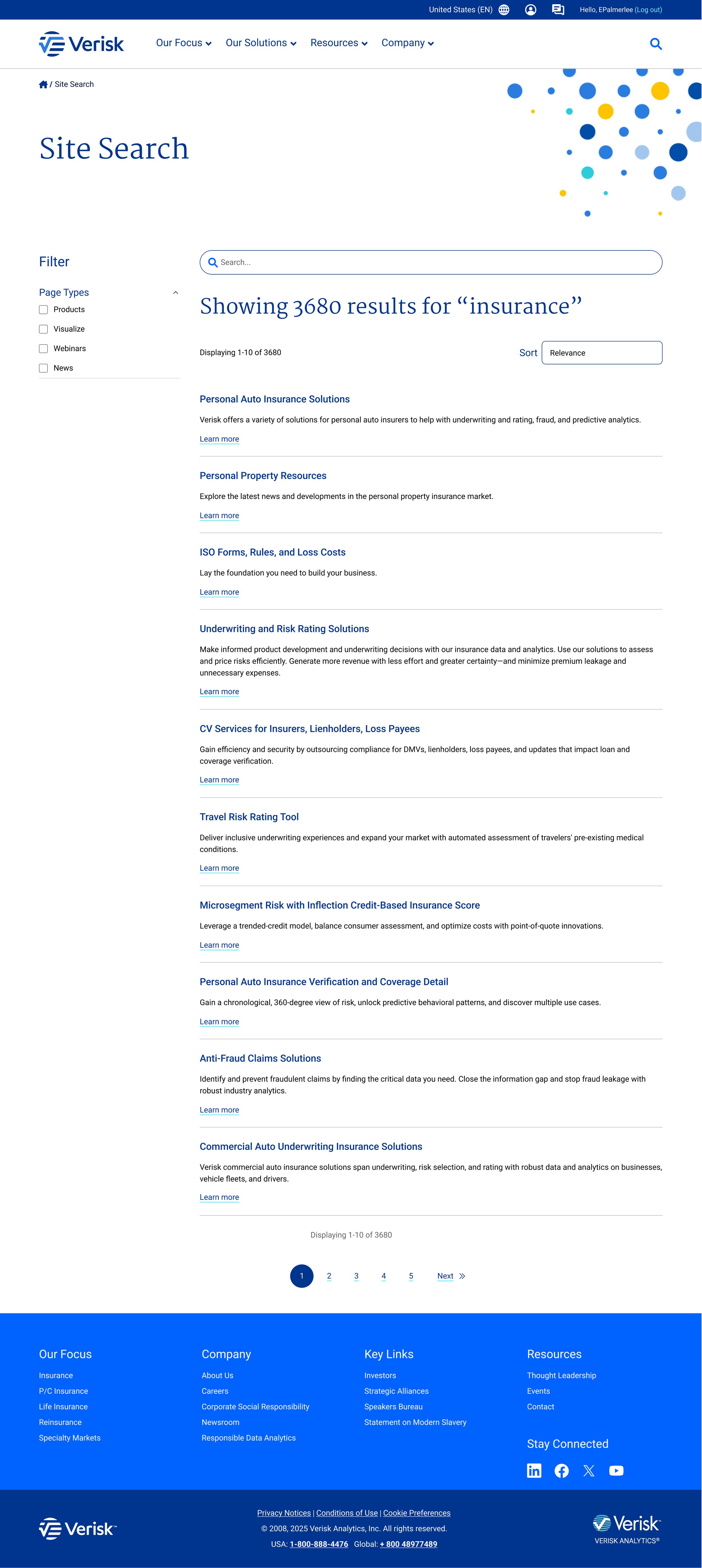
As part of the design process, we incorporated the newly released brand guidelines into the final deliverable. Because the guidelines were so recent, the existing website hadn’t yet adopted them, making our page design one of the first to bring the updated brand to life. The client team provided us with all the necessary assets and direction to ensure alignment.
Style Guide
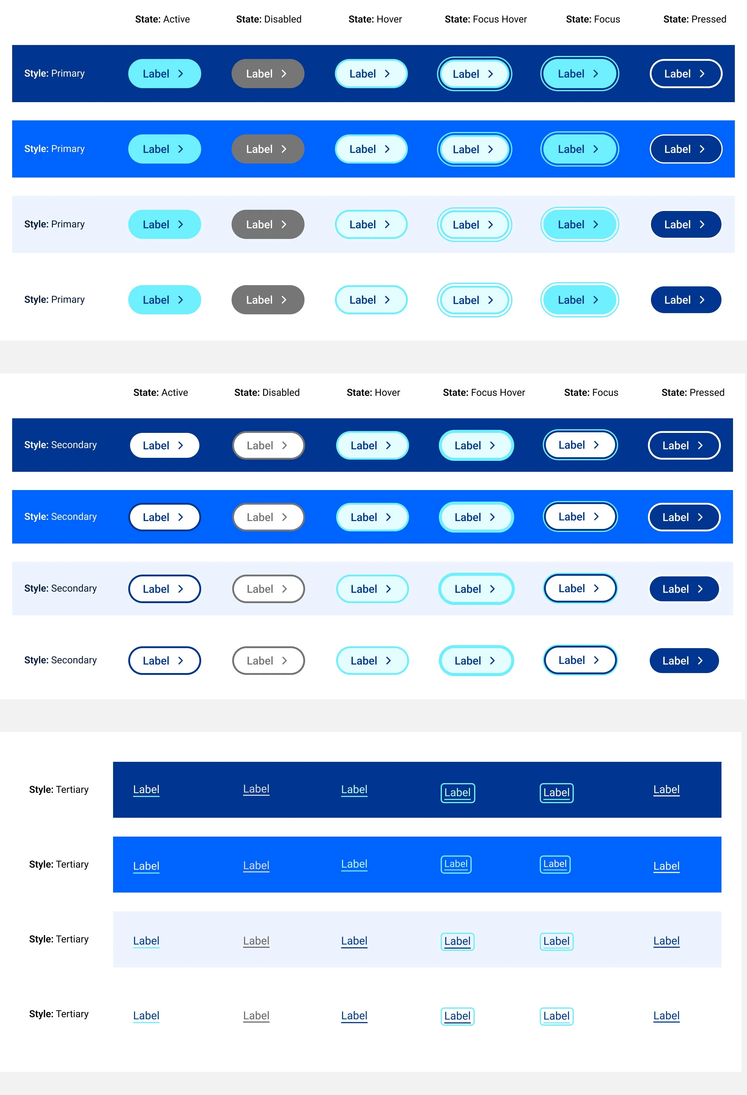
The client shared a brand guideline document along with page examples using the updated system. Using these resources, we built a comprehensive style guide in Figma to ensure consistency across the project.
Below is the Figma style guide we developed, followed by the example pages.


Page Examples


Desktop & Mobile
We completed two rounds of wireframes followed by two rounds of design to arrive at the final product. To meet the tight deadline, development handoff and documentation began alongside the final design phase, ensuring the page could move into build quickly.


