New Landing Pages
Corpay - Comdata
Project Overview
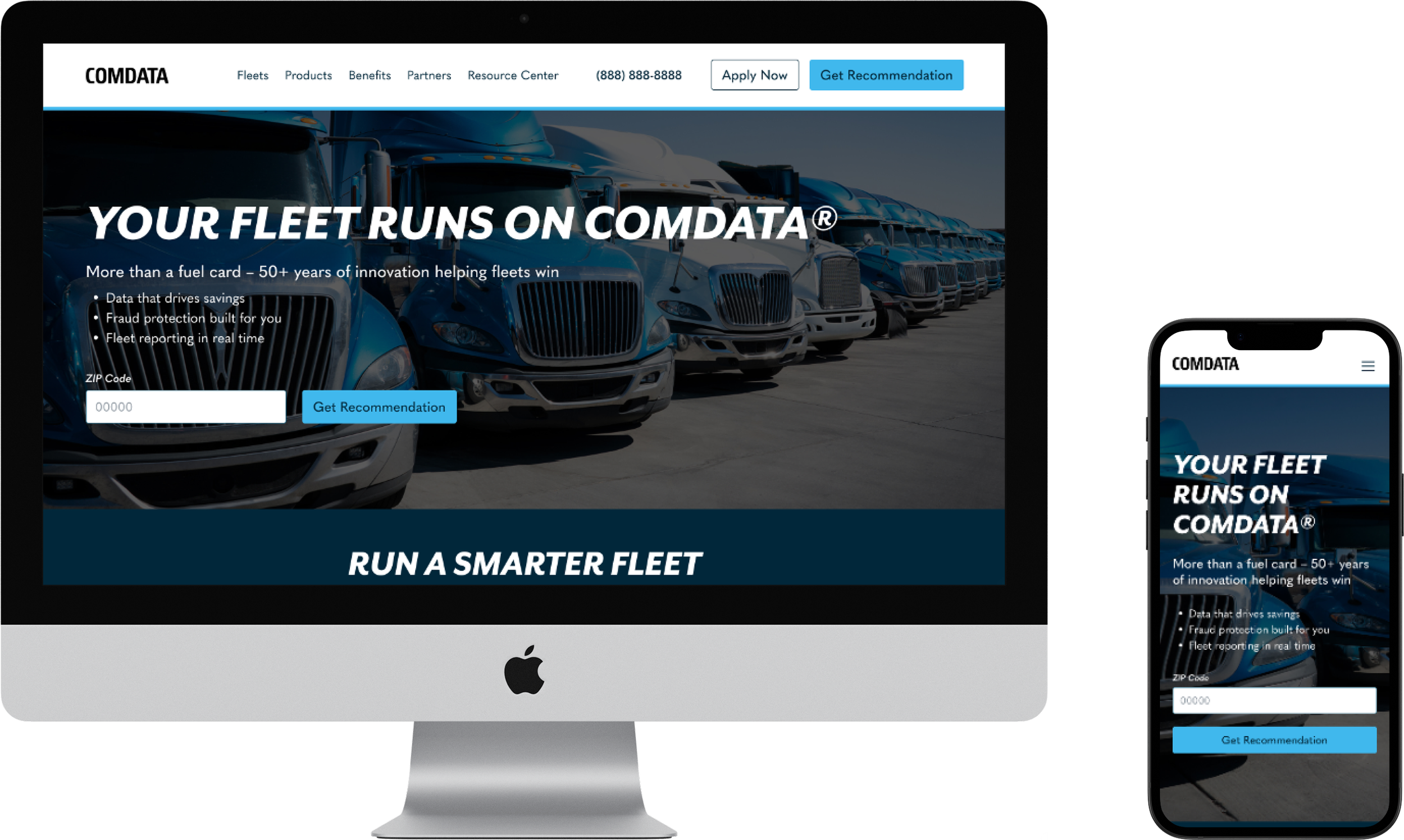
Comdata is updating its digital experience to match a new product structure and better serve different fleet audiences. After a recent hackathon and website audit, the team is focusing first on the Homepage and key pages for Small Fleet customers.
The main goal is to introduce new fuel card tiers—Basic, Medium, and Best—through clearer customer journeys and easy-to-use comparison tools. This redesign is part of a bigger effort to boost conversions, simplify product choices, and give small and mid-sized fleets stronger digital support.
-
-
4 weeks
-
Product Designer
-
Wire Framing
Prototyping
Visual Design
Design Presentations

Research & Discovery
What are the primary objectives?
To design a streamlined, modern user experience that:
Presents Comdata’s new offer structure (Basic, Medium, Best)
Supports audience segmentation by fleet size and type
Increases product engagement and application starts
Aligns with brand and performance best practices
Who will be using this page?
Owner-Operators
Small Fleet Business Owners
Midsize/Large Fleet Managers
Partners and industry stakeholders evaluating Comdata’s offerings
Homepage:
Serve as an entry point to segment users by fleet type
Introduce Comdata’s core benefits and offer tiers
Drive users to relevant pages
Small Fleets & Muthatrucker Page:
Present product tiers with feature comparison
Reinforce trust and credibility through "Big Stats" and partner logos
Drive conversions through "Apply Now" CTAs
What is the main purpose of these pages?
What we know so far:
The project is Comdata’s top digital priority, taking precedence over all other requests with the agency.
The updated experience will need to differentiate product tiers, simplify user flow, and allow for fast handoff to Comdata's internal copy and dev teams.
Wireframes & Design
The Process
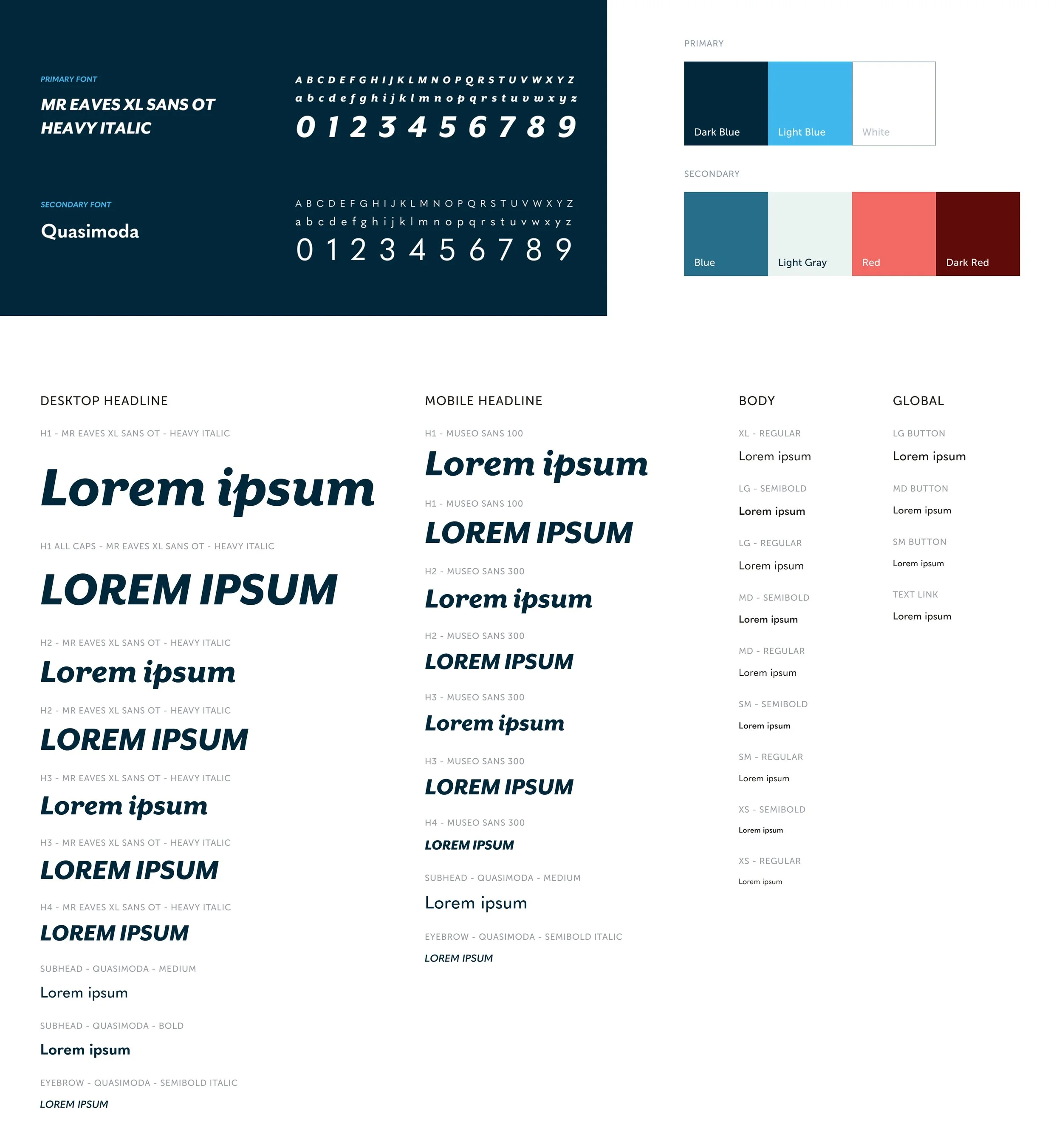
In our design process, we jumped in with the recently released brand guidelines and wove them into the final design. Because the style guide was newly developed, our page was one of the first to showcase the updated branding. The client supplied all the assets and guidance we needed, so everything lined up nicely.
We completed two rounds of wireframes followed by three rounds of design to arrive at the final product.
Wireframes


Style Guide

Design


