
Navigation Redesign
Rooms To Go
Project Overview
Rooms to Go asked for outside expertise for reasearch and ideation for their internal UX team.
MaxMedia’s UX design team has a particular skill set in digital and physical integration with a majority of the team having an architecture background. MaxMedia’s assignment was to step in and help with a range of projects.
This case study covers the process of redesigning the navigation.
-
Rooms To Go
-
8 weeks
-
UX Designer
-
User Research & Testing
Wireframing
Prototyping
Design Presentations
Research & Discovery
What are the primary objectives?
Increase “findability” for both the digital resident and the digital visitor user. The digital visitor is more likely to use the navigation to find an item where the digital resident is more likely to use search.
Utilize more imagery in the navigation. Opportunities to use more category and design inspiration photos as well as iconography for way finding.
Focus customer on the navigation items. Need more hierarchy in text styles and overall better use of whitespace.
Increase interaction with embedded concepts in RTG brand. Bring appropriate attention to “Shop by Room” feature as well as the featured collections.
What are the current pain points?
Too many sub categories
Not enough main categories
Long lists of items; no text hierarchy
What do we need to know?
-
Simplicity: avoid clutter
Websites with simpler designs have higher conversion rates
Too many categories will confuse the user; use broad terms to categorize the products
Get rid of ads
82% of shoppers in the U.S. say online ads are disruptive
Flexibility: accept as many payment options as possible
All credit cards, PayPal, Apple Pay, payment plans
Make sure all products are clearly and appropriately labeled
Offer free shipping
Unexpected costs are the top reason for cart abandonment
Transparency: informative product descriptions
But keep it concise
Easily accessible customer service
Partner with brand influencers
Establishes credibility to drive sales
High quality product images
Video demonstrations. 90% of consumers say videos help them make a decision about purchasing a product
Feature customer reviews and testimonials
-
Digital Inspiration: be visible
Discovering new products and finding inspiration
Hoping to be excited by what they see
Stumbling upon inspiration when they’re not looking for inspiration
70% of consumers purchased from a brand after seeing a video on YouTube
Show up through out the purchase journey with clear information on products, services, and availability.
Supportive Spending: take a stand
Shoppers putting their money where their values are
Sustainability, recycling, cruelty free, etc
Searches for “ethical brands” and “ethical online shopping” grew 300% and 600% year over year in 2020, respectively
Wear your brand values like a badge of honor
Be as detailed as possible, consumers are getting more sensitive to greenwashing and superficial statements
Give people a reason to support you and find authentic ways to follow through
Convenience: be flexible
Curbside pick-up and same-day delivery became staples for many people
Global searches for “along my route” (+1000%) and “curbside pickup” (+3000%)
Convenience became a key differentiator
Beyond location and availability retailers have been tapping into innovative services like virtual try-ons
Provide choice and flexibility in your delivery and collection options
Dynamic Demand: embrace change
Increase in searches for hobbies and new habits
Searches for “candle making kits” rose 300%
Searches for “patio heaters” rose 600% as people moved outdoors
Use insight tools to stay in touch with consumer signals
Prepare for rapid, short term shifts in demand
-
Baby Boomers: born 1946-1964
Prioritize convenience above all else
Significantly less likely or willing to explore a store for new products
With a greater amount of disposable income, Baby Boomers are not searching for the best bargain, which is a greater characteristic of Millennials and Get Z
Baby Boomers are very comfortable browsing and shopping online with 66% of Boomers reportedly making regular purchases on the web.
Baby Boomers by far prefer the personal engagement of traditional stores
Gen X: born 1965-1980
Gen X is often referred to as the “middle child” generation due to its reputation of being forgotten by marketing specialists. Because of this there is little market research into their spending habits.
Gen Xers tend to shop more conservatively than other generations
More skeptical of marketing tactics, Gen X won’t purchase a product until they’ve researched it thoroughly
Make extensive use of search engines, online reviews, and social media networks before making a purchase
Millennials: born 1981-1997
69% of Millennials demand the convenience of omnichannel accessibility. Having an experience that can transition their consumer data from their smartphone, to laptop, to local store, and back again
82% of Millennials say word-of-mouth is a key influencer in their purchase decisions
Skeptical of overbearing marketing tactics and reject retailers who constantly push
Sees shopping as a social activity (Millennials largely see shopping as fun and relaxing)
Gen Z: born 1998-2010
Generation of digital natives who cannot remember a time before the internet
While much of their research is digital, Gen Z still prefers to shop in-store and see it as a social activity
Technology and social media presence drives Gen Z’s shopping experience
Gen Z is likely to contribute to consumer-generated content for brands
Providing consumer-generated content is crucial for retailers to reach this generation
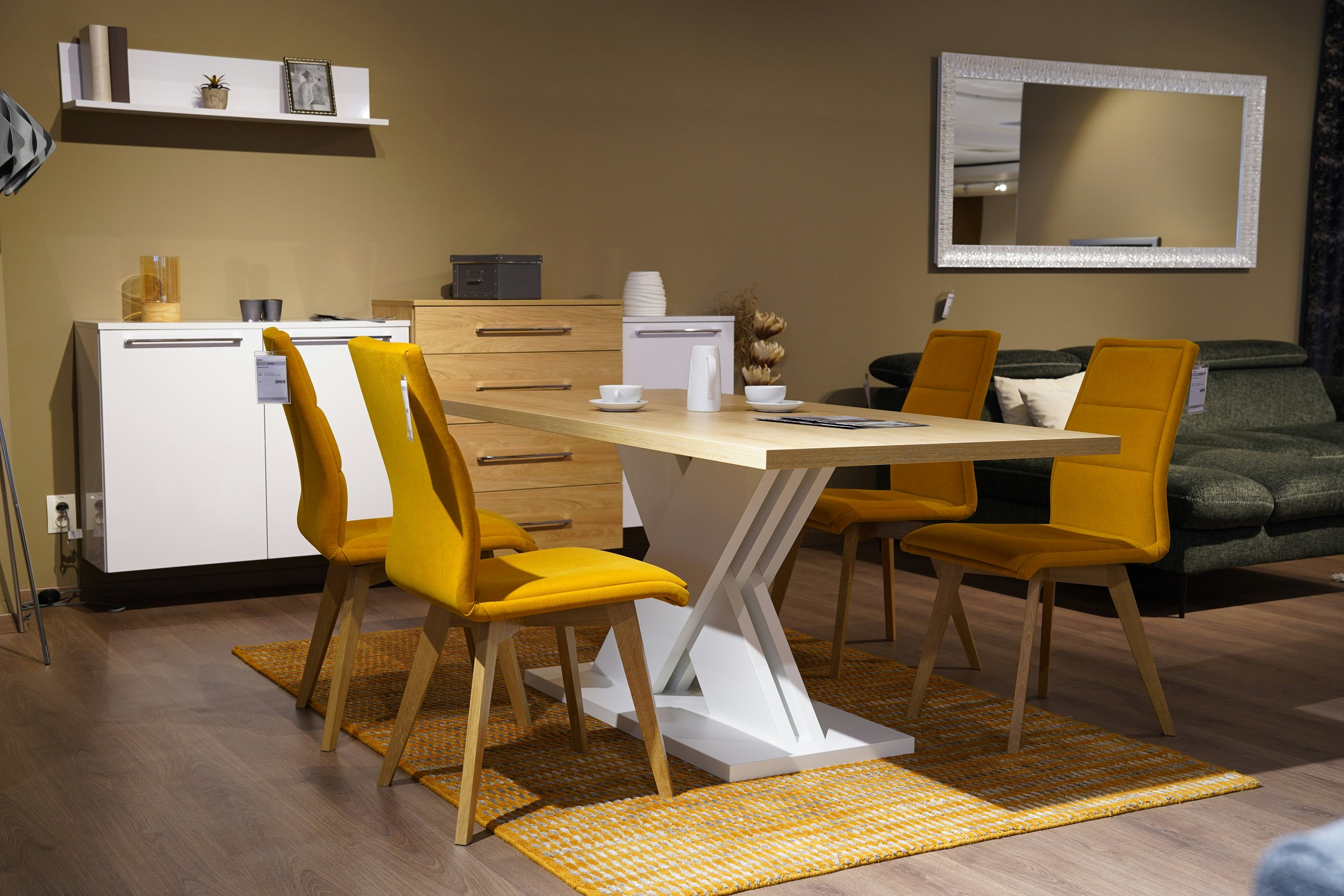
Site Visit: 3 retailers
Rooms To Go
What was successful:
Sales staff were attentive and knowledgeable about show room products
What could use improvement:
Product sales sheets are difficult to understand
Too many options/products to look at; hard to make a decision while in the store
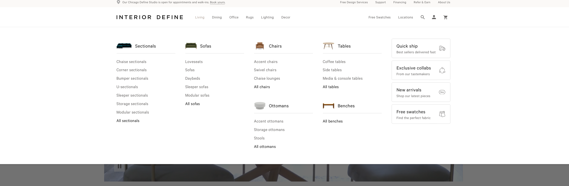
2. Interior Define
What was successful:
Creating “rooms” with a small, open floor plan
Showcases customization options without overwhelming the shopper
What could use improvement:
Limited options and configurations in the store
3. Restoration Hardware
What was successful:
A lot of interior design thinking is done for you
Easy to imagine living in the spaces they’ve created
What could use improvement:
Very overwhelming experience; impossible to see everything
RTG Focus Areas
Decision Making
Showroom is very product heavy; it’s hard to remember what you’ve seen
Hick’s Law
The time it takes to make a decision increases with the number and complexity of choices available
Customization & Product Sheets
Product sheets and room set descriptions are difficult to understand even before customization is considered.
In-Store Availability
Automatic alerts and features in place to make sure your local store has the items you’d like to see in stock before arriving.
Existing Conditions
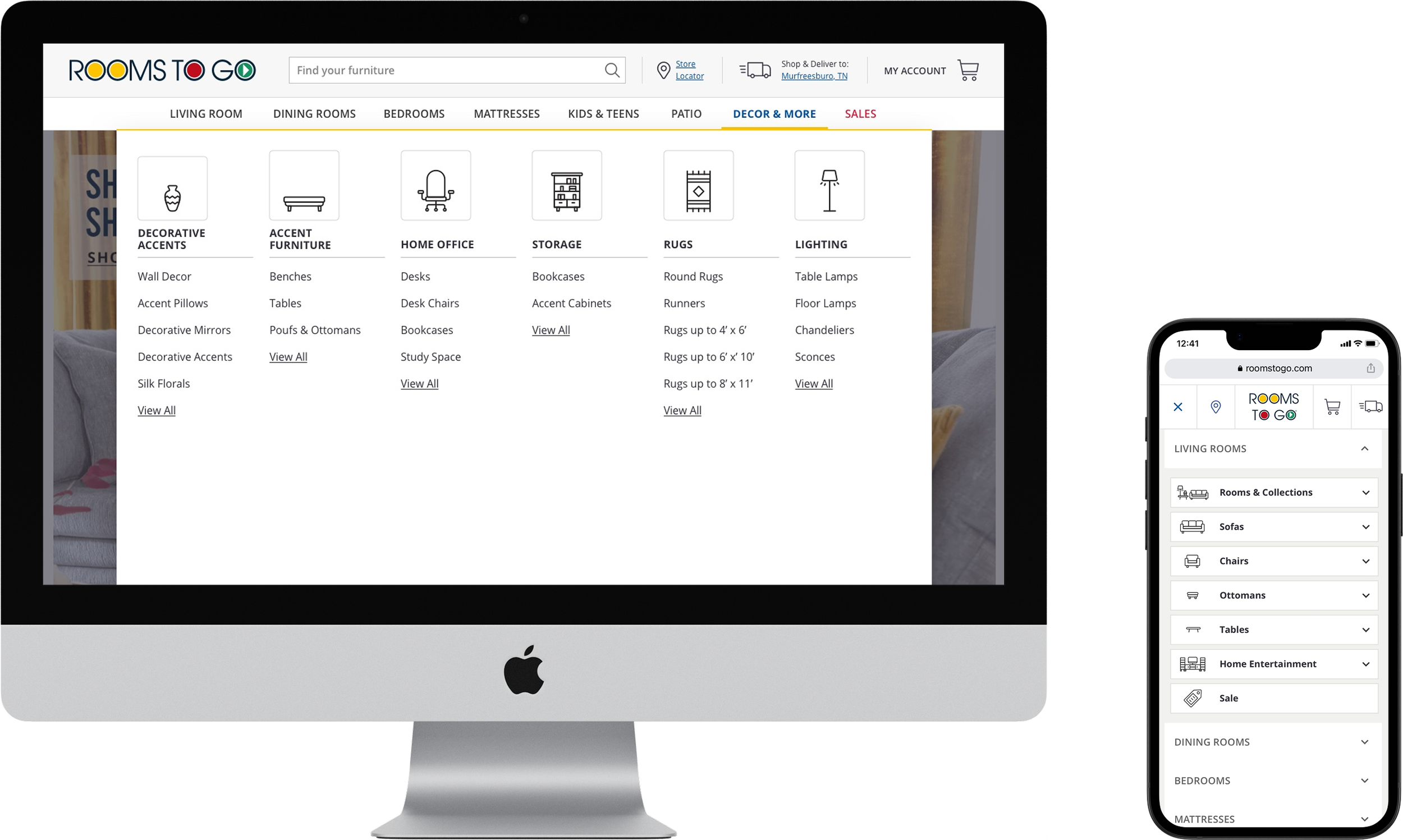
Navigation is accessed by main double header with corresponding drop down menus. While the menus are more concise than other retailers the lack of text hierarchy makes scanning the subcategories difficult. The drop downs could benefit from some layout reorganization to eliminate the existing trapped white space.
Search bar is located at the top center of the browser window and was often hard to find in user testing. The immediate search results are only text related; no visuals.
Filtering is located on the left hand side of the PLP and gives a wide variety of filtering options.

Comparative / Competitive Analysis
A comparative / competitive analysis was done for 6 other furniture retailers.
Navigation, search, and filtering options were reviewed and analyzed for all 6 companies.


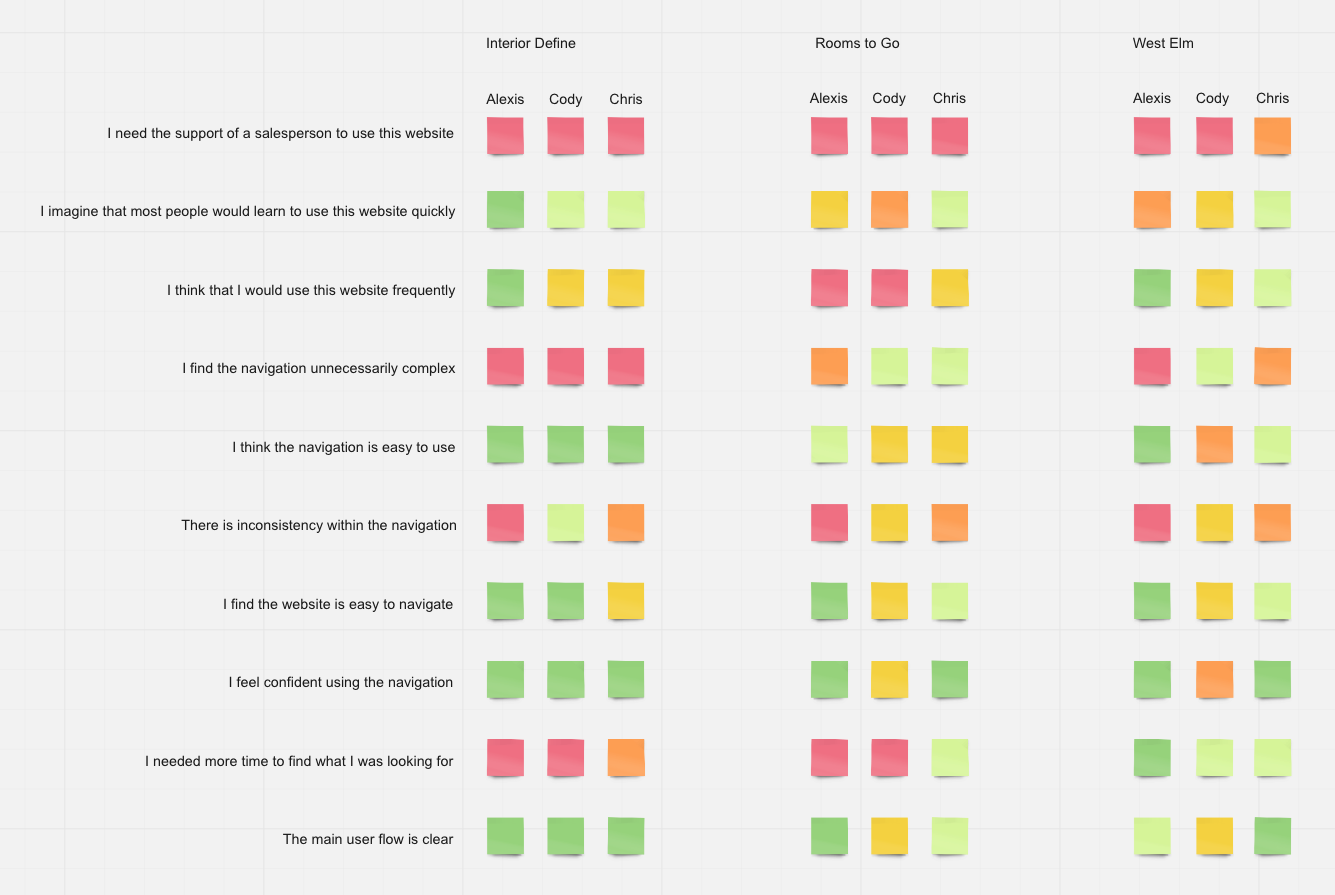
Testing
Objective
To verify the design team is moving in the right direction the usability of 3 differing navigation and search styles will be compared along with 2 major buying demographics.
Testing Plan
Ask participants to find a specific item as well as the last thing they bought for their home on each of the sites.
See below documents for more detail.
Intended Outcome
Show the benefits or disadvantages of simple and detailed navigation menus with the 2 major buying demographics. Information collected from this will inform the final search and navigation design.
Testing Sites
CONTROL: Rooms to Go
DETAILED: West Elm

Testing Groups
Baby Boomers
60-80 year age range
Has shopped for furniture multiple times for multiple homes/environments
4 users tested
SIMPLE: Interior Define
Millenials
20-40 year age range
Is starting to shop for furniture or has furnished their first living space on their own
3 users tested
Testing Results
Baby Boomers


60-80 year age range
Has shopped for furniture multiple times for multiple homes/environments
4 users tested
Millenials
20-40 year age range
Is starting to shop for furniture or has furnished their first living space on their own
3 users tested
Ideas Confirmed
Baby Boomers reacted positively to a more detailed navigation
Millennials found the simpler navigation easier to use and didn’t like the complexity of Rooms to Go or West Elm
Millennials felt the Rooms to Go site was “cluttered”
Baby Boomers and Millennials liked the incorporation of product images in the nav
New Discoveries
Baby Boomers relied on product images to make decisions and were very visual
Millennials were drawn to inspiration images to make decisions
Baby Boomers only noticed the search bar when it was on the left side of the screen
Millennials wanted more text differentials/hierarchy in the more complex navigation menus
Design
Concept Design
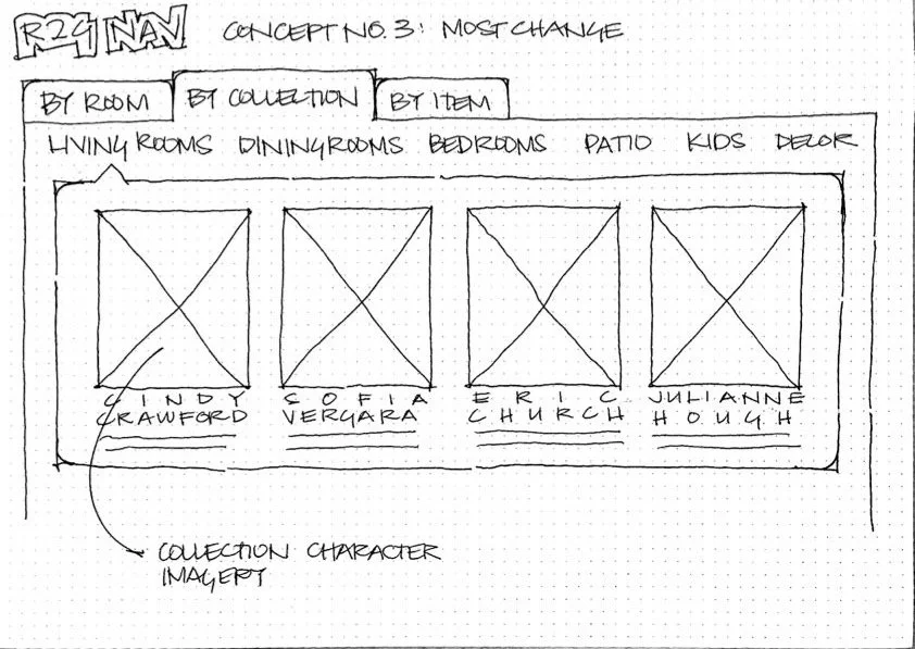
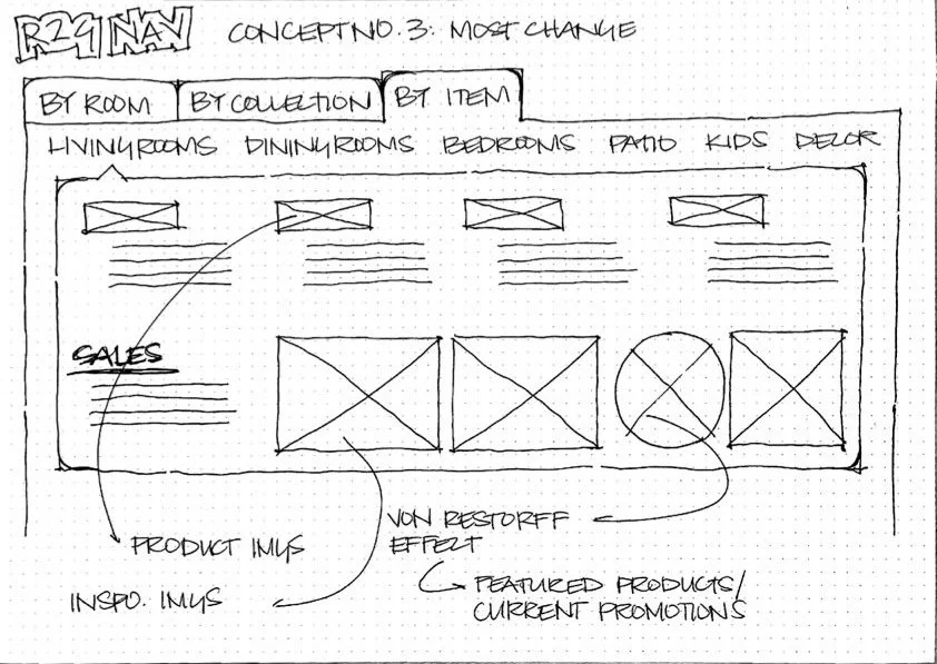
Concept 3: Most change
Shop by Room
In this concept three ways to shop for furniture have been determined: room, collection, and item.
Shopping by room will provide inspiration imagery to help direct customers to the type of items they are most interested in seeing based on their design style.
The Von Restorff Effect will be used to direct a customers attention to specific imagery for a featured product or current promotion.

Design Development
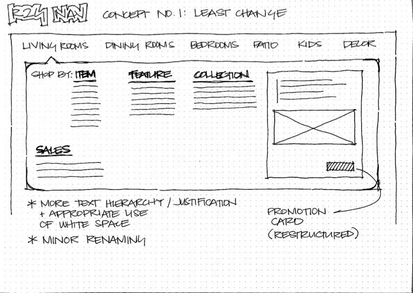
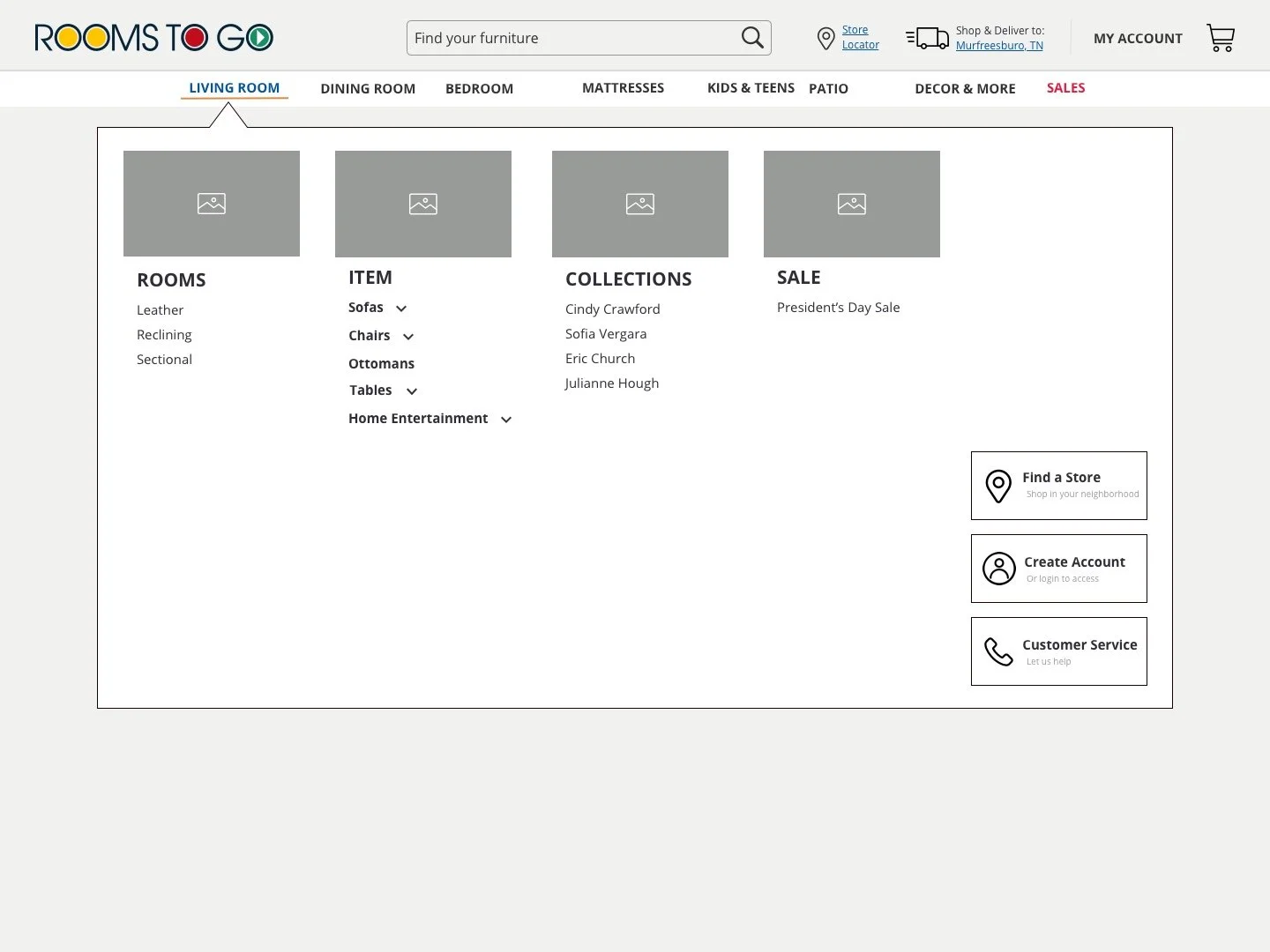
Concept 1: Least amount of change
This concept shows a version of the navigation that most closely resembles the current design and layout.
By incorporating more text hierarchy and minor product renaming the panel becomes easier to take in and understand. Adjusting the layout of the promotion card also creates a more seamless experience.
Concept 3: Revised
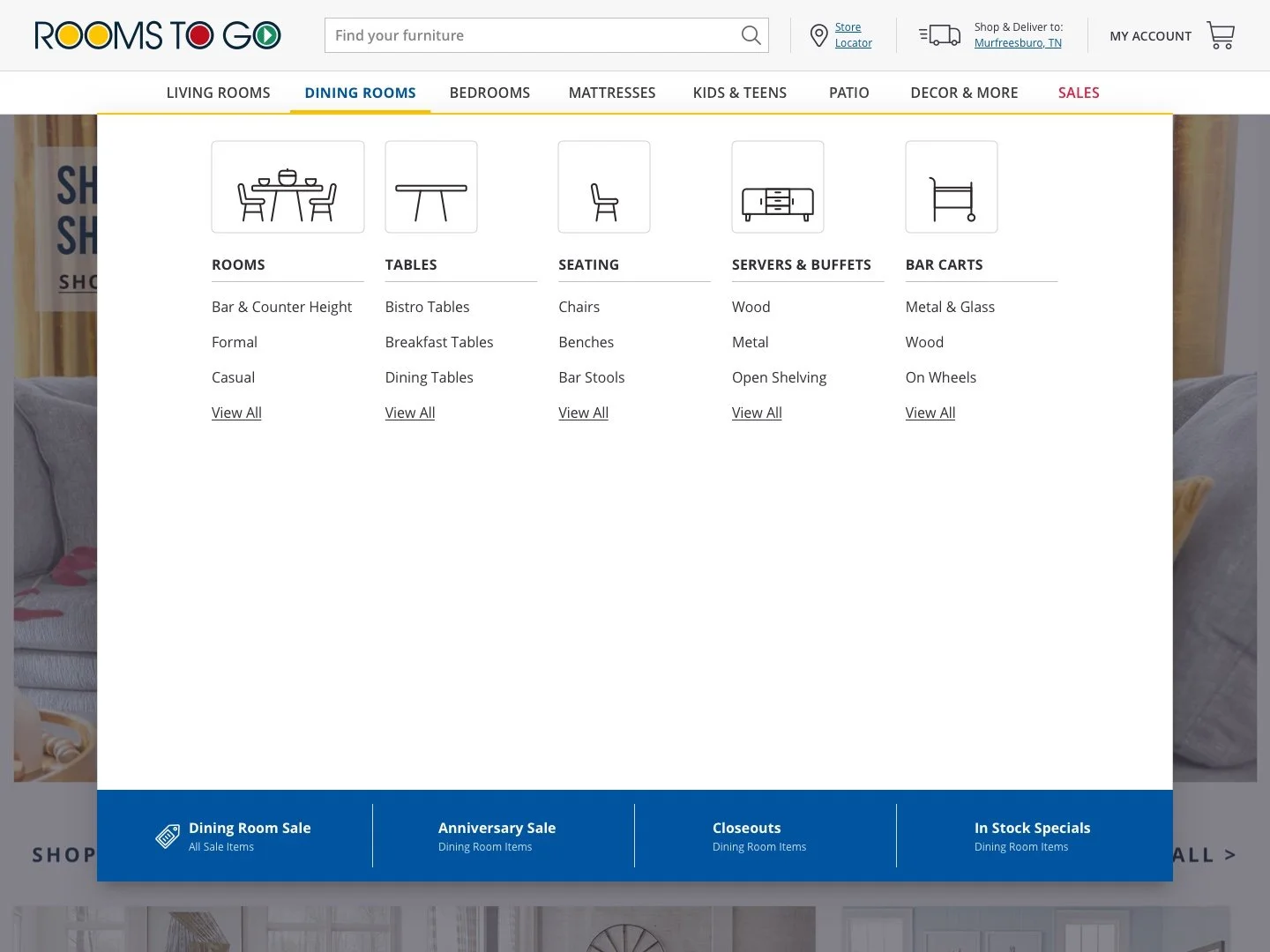
This version of the navigation, for both desktop and mobile, still uses imagery components, category consolidation, and minor renaming from the previous version but it has been reorganized to include more information upfront.
Drop down menus were eliminated and categories were added and rearranged to fit everything comfortably.
Features buttons for a store locator, account creation, and customer service were moved to the base of the navigation menu.
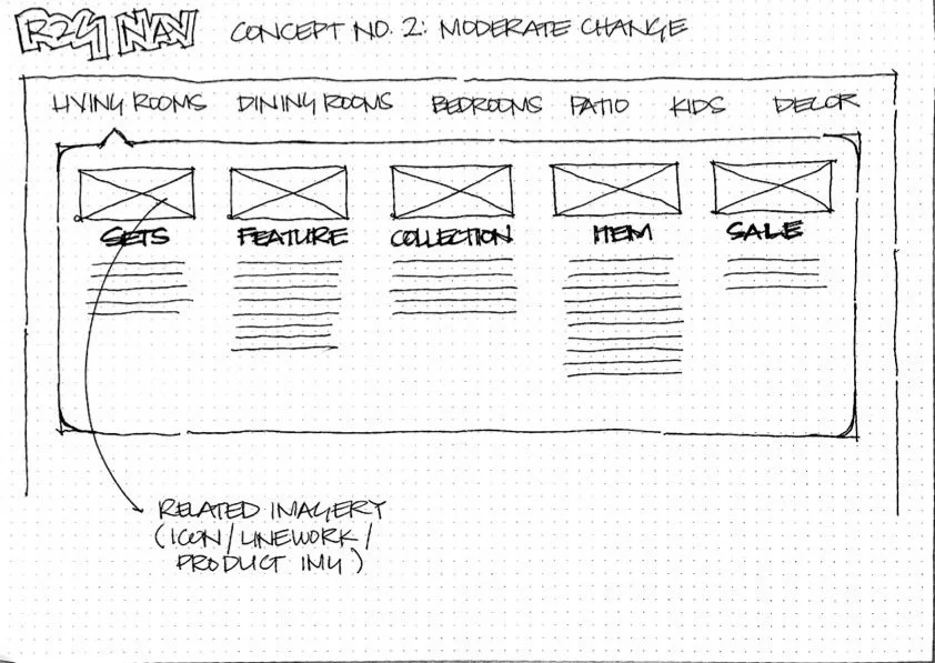
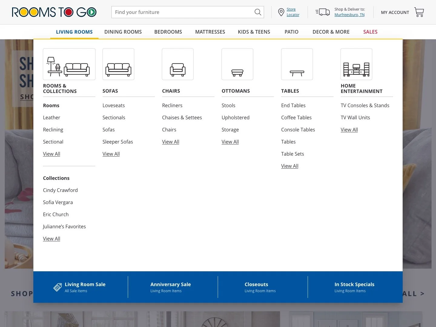
Concept 2: Moderate change
This concept shows a version of the navigation that has a moderate amount of change that isn’t dissimilar from the current navigation but does involve a restructure.
By introducing visual components customers will be able to interpret the navigation menu quicker to find what they are looking for. This concept also includes minor product renaming in an effort to consolidate.
Shop by Collection
In this concept three ways to shop for furniture have been determined: room, collection, and item.
Shopping by collection will show available or featured collections for each room type with a promotional image for each to give customers a sense of what the collection will look like.
Kids & Teens
Shop by Item
In this concept three ways to shop for furniture have been determined: room, collection, and item.
Shopping by item will show both product specific images for the main navigation categories as well as inspiration imagery for those who would like it.
The Von Restorff Effect will be used to direct a customers attention to specific imagery for a featured product or current promotion.
After presenting all concept sketches the team moved forward with concept 2 and 3 with some changes.
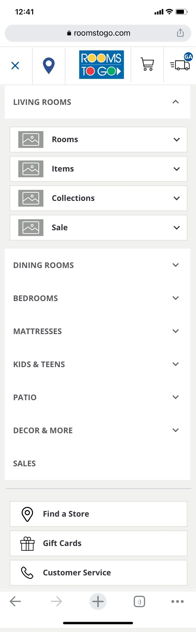
Concept 2: Revised
This version of the navigation, for both desktop and mobile, uses the imagery component, category consolidation, and minor renaming from concept sketch 2.
Drop down menus were incorporated in order to reduce the visual load of all the items listed out.
Features buttons for a store locator, account creation, and customer service were added.

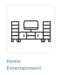
Mattresses
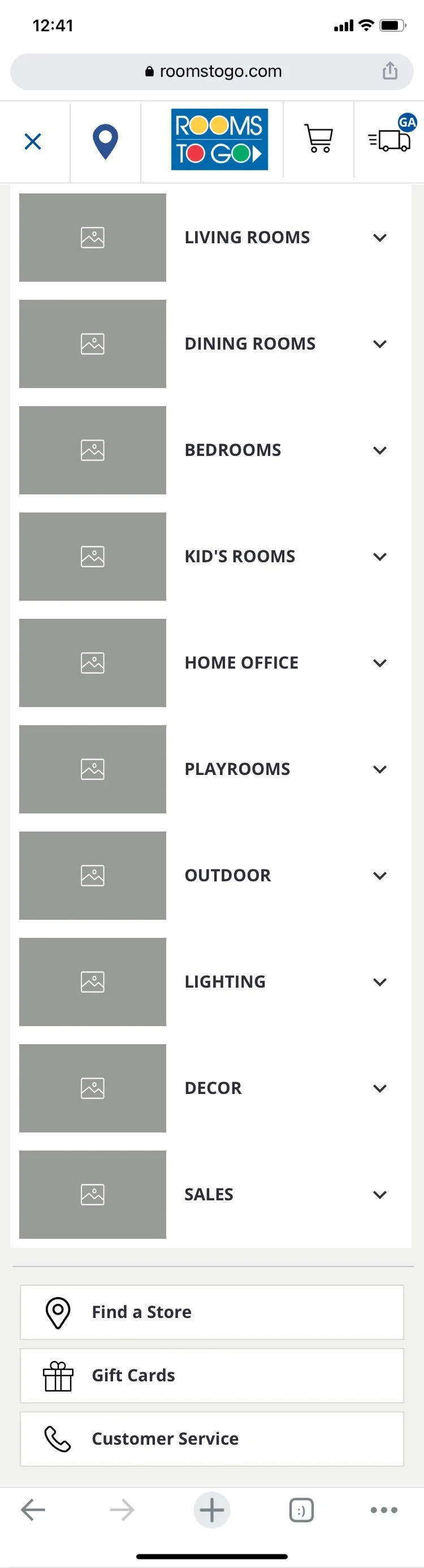
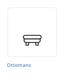
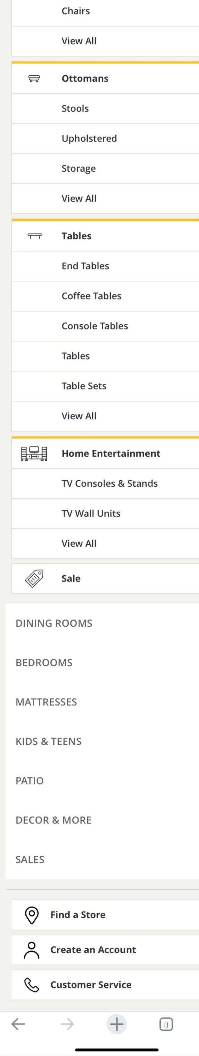
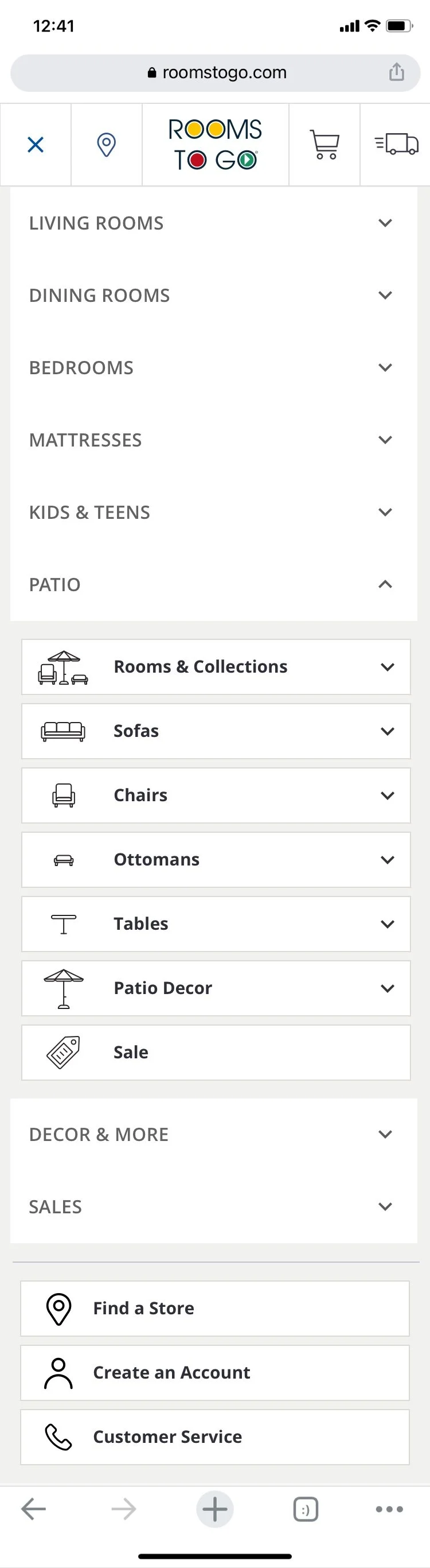
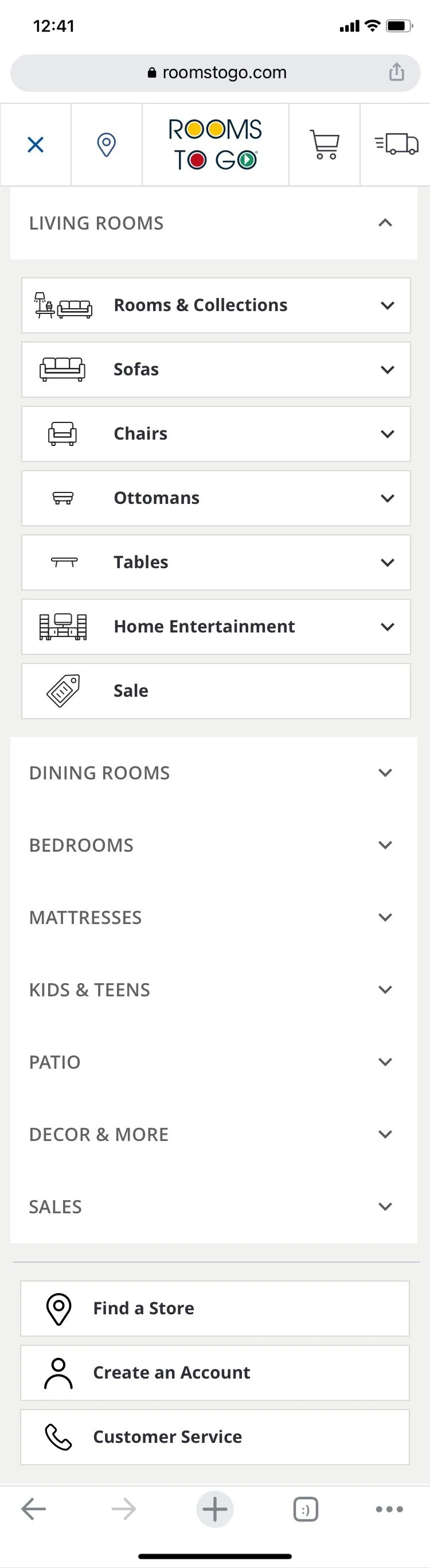
The final design of the mobile navigation uses the same iconography from the web design to create a seamless experience and help customers visually navigate the menu.
Text hierarchy easily shows primary vs. secondary information and provides a visual break in the longer lists of items.
The yellow accent appears for expanded menus to help customers orient themselves.


Living Room

Mattresses


Living Room Icon Set


Bedroom
Patio
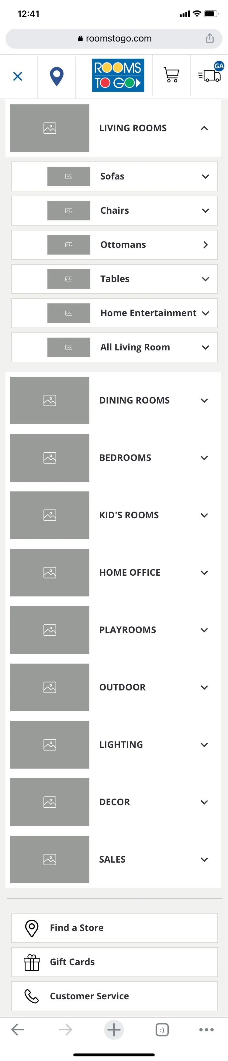


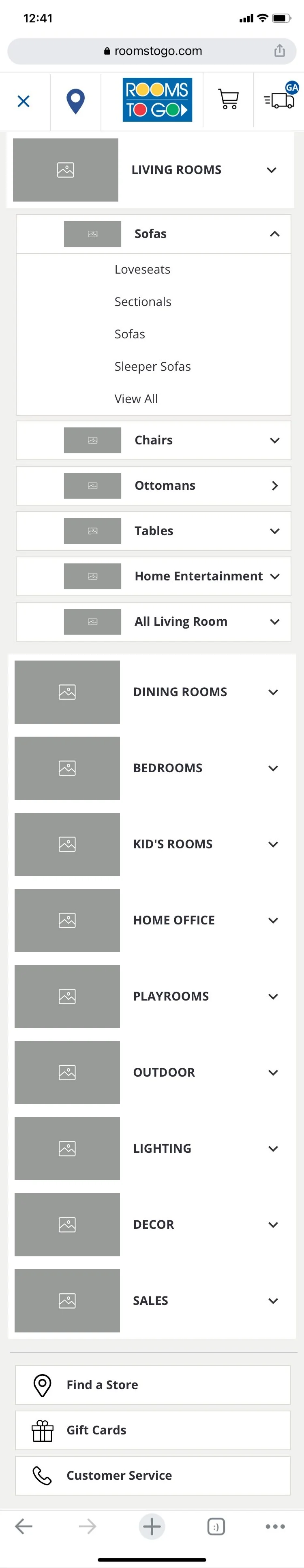


Final Designs
The final design of the navigation uses iconography as a quick and simple way for customers to scan the navigation menu to find what they are looking for.
Text hierarchy easily shows primary vs. secondary information and provides a visual break in the longer lists of items.
The banner at the bottom of the menu gathers all sale information.
Dining Room

Living Room
Dining Room

Kids & Teens
Patio

Bedroom

